Reading Challenge 2016: A Book You Can Read In A Day

Julie Maroh Skandalon

Mario Saraceni The Language of Comics

Skandalon_top pictureI’m kicking off this year’s Reading Challenge with a couple of books, both of which can be read in a day: Julie Maroh’s Skandalon, and Mario Saraceni’s The Language of Comics, and I’m going to use one to discuss the other. A little bit of background is necessary for the Maroh novel, however: it can be read and understood on its own terms, naturally, but Maroh provides an Afterword which situates the main character in a different, more mythical dimension and provides an explanation for his behaviour which goes beyond the rather trite summary to be found in the book’s blurb: ‘a fiery and intense contemporary myth about the recklessness of fame’. Well, no, not really. The myth in question here is not a new one for our times, it is a much older myth that has been retold in a modern setting with a main character who is the perfect vehicle: an immensely successful rock star who wields enormous power over his fans, men and women who adore him and follow wherever he leads.

Skandalon is a truly astonishing book. Much is explained in Maroh’s Afterword, which, following the writings of René Girard, sets out the philosophy of prohibition and the way in which myths and rites produce stories which become culturally embedded, thereby reinforcing and perpetuating accepted behaviours. The skandalon is a figure that transgresses these imaginary boundaries, attracting scandal as he does so and encouraging others to mimic his behaviour. But inevitably, the skandalon eventually becomes the scapegoat or victim. He who has vicariously fulfilled the desires of others has to face the consequences as the people turn on him – which they must, if societal order is to be restored. And so it is with Maroh’s main character, Tazane, the name being of course a pseudonym. His real name is Cedric. (One of the other characters suggests that the name Tazane is cursed and all would have been well if they’d stuck to Cedric.)

Saraceni’s book is a wonderfully accessible introduction to the study of comics as multi-modal texts: complicated concepts are made simple and exemplified with reproductions of numerous individual frames and complete comic strips. What I propose to do here is to explore a few of Saraceni’s observations with reference to Skandalon, but what follows is certainly not going to be an exhaustive exploration of how comics work – merely a taster.

One of the most interesting points of Saraceni’s discussion lies in his comparison of the layout and format of a comic strip with that of a text composed entirely of verbal features. He notes that the difference between functional and content words is reflected in the make-up of the verbal and visual language of comics, where functional words (words that link other words together to build a sentence, such as conjunctions and prepositions) have their counterpart in functional components, and content words (nouns, verbs, adjectives, etc.) in content components. The functional components of comics are things like captions, sounds effects and emanata (text or icons that represent what’s going on in a character’s head, so for example, sweat drops can indicate anxiety or nervousness). In this image here, for example, the ringing of the telephone rendered by the dring sound effect becomes more insistent over the three panels; Tazane ignores it, but the increased size of the letters and the frequency with which they appear indicate both the character’s consciousness of the sound, the length of time which has passed since the telephone first began to ring, and his growing agitation as the words gradually fill the frame. (Eventually he rips the socket from the wall.)

Skandalon_emanata

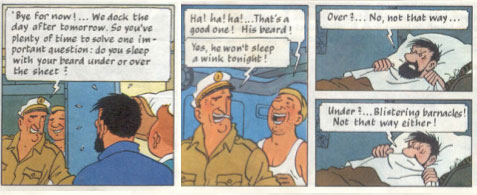
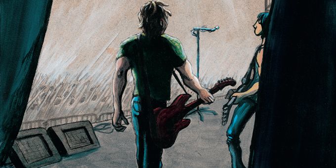
Another functional component is the speech balloon. This is the space that is used to report what a character is saying, and its physical appearance on the page acts as a sort of adverb to tell us how something is said. Here, for example, we know from the visual elements (the crowSkandalon-redd, the microphone) that Tazane is onstage singing, but we can guess from the spiky balloons and large spaced-out font of the letters that he is not crooning softly, but belting out the words. The colour scheme reinforces this impression: think how these panels would differ if rendered in pale blue or green, for example.

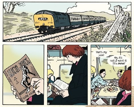
Saraceni also argues that the gutter – the blank space separating the panels – ‘is similar to the space the divides one sentence from the next’. The gutter is not simply a blank space, in fact: every narrative is necessarily incomplete and this is a space for the reader to fill with real-world knowledge. Take the following example.

montage skandalon

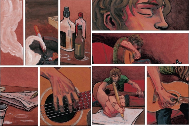
This montage is made up of two pages, with the page break occurring down the middle, after the third panel from the left: this is important, because in the Western world we read each panel from left to right, top to bottom, and we do the same thing with the whole page.

So what’s happening here? We see first of all a cloud of smoke. On its own, this means that something is on fire, but what? In the second panel, a lit cigarette lies next to a butt in an ashtray, and we can see that the smoke comes from the cigarette. The ashtray is on a table, and in the third panel, we see what else is on the table: empty or near-empty bottles of alcohol – spirits and beer rather than wine – one bottle could be vodka, another Jack Daniels. The fourth panel shows us another view of the table (and all the time, the repetition of the table image is leading us to assume that it is the same one): a pencil, and some papers with musical notation. Finally, the fifth panel shows us the human agent behind all this – a hand playing a guitar – and we can infer that the musician shown here is the one who has been smoking, drinking and writing music. This is Tazane.

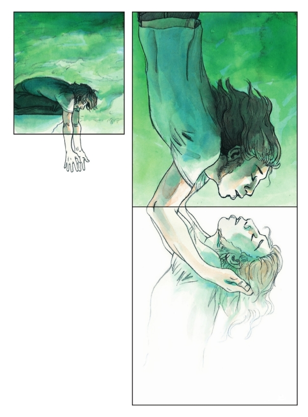
Onto the panels on the right-hand side of the montage, and we see at the top a close-up of Tazane with eyes closed, clearly absorbed in his task. The ‘camera’ pans out for the next panel and we see him playing, the tops of the bottles just visible in the right-hand corner. In the panel which follows, Tazane is writing on the paper, and we can infer again that he is writing down the tune he has just played, or perhaps some lyrics. The foreshortened perspective of the image ensures that the hand holding the pencil is central to the panel, with the trajectory of the pencil leading the eye back to Tazane’s face and from there down to the point of the pencil again, following the circle of thought from the origin to the recording of that thought. He returns to his playing for the final frame, depicted from yet another angle, and here we note an interesting point Saraceni makes about the panel – that it is not the same as a photograph or a film still, because the panel represents a portion of time rather than a snapshot. The final frame of this sequence could take up any amount of time: he could be playing for a few seconds, or a few hours. Panels can fill an entire page, as the one shown below does.

Skandalon_peaceful

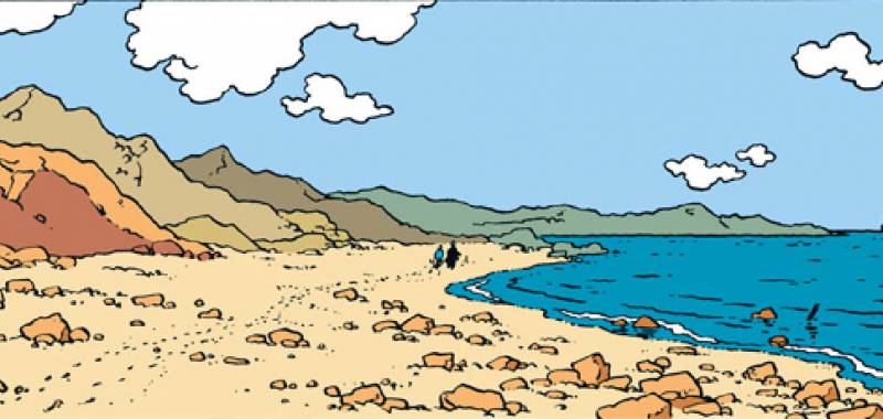
And there are numerous other examples of one-page panels in Skandalon. Page 85 is entirely blank, with not even a page number, but this can also be considered a panel; in fact, the page is blank because the narrative has reached a point where Tazane rapes a young female fan, and the blank page emphasises the horror of the scene by hiding it from the reader.

I mentioned the ‘camera’ earlier, and something that has sparked interest in recent years is the presence of the narrator in comics and graphic novels. In Skandalon, Tazane himself does some of the narrating for us, rendered in square captions in a font different to that of the round speech balloons. So Tazane is narrator as well as character. The other character, Philippe, also does a little narrating for us. On finding the remains of Tazane’s mobile phone, he says ‘Not again!’ – but who is he talking to? Ostensibly, himself, but arguably he is speaking to the reader as well and imparting the information that this is not the first time Tazane has smashed up his phone. But I think there is yet another narrator, the one that decides what to show us in each panel and whose point of view we see: close-ups, for example, are more likely to invite us to feel empathy for the character concerned. Creating a graphic novel involves decisions about the shape and size of each individual panel, its positioning on the page, its relation to other panels and its place in a sequence as well as what is depicted, how characters and events are depicted, what point of view is represented, whether or not captions are used, and many, many other decisions relating to both functional and content components. It is perhaps here, in these decisions, that we should be searching for the narrator. Saraceni recognises that the narrator’s presence cannot be reduced to a consideration of captions alone. The kind of syntagmatic and paradigmatic analyses that are applied to verbal texts can equally be applied to graphic novels, if we consider creative choices made on both horizontal and vertical levels.

skandalon-narrator

To conclude, Skandalon is a disturbing but immensely rewarding read, and Saraceni’s exceptionally useful book helps the reader to understand and articulate Maroh’s work. I’ve had a happy week with this, all in all.

skandalon_narcissus
Interesting use of panels to show the division between land and water in Tazane’s heroin-induced narcissistic hallucination.

My Top Five Favourite Comic Books, an Outsider: ‘Dotter of Her Father’s Eyes’ by Mary and Bryan Talbot

Image

Today has been a rotten day, to be honest. When the metaphorical whistle blew on my day job, I waded across the sludgy campus to spend the afternoon in the library, where long-suffering library users like me who actually want to Do Some Work huddle hopelessly in the silent study rooms on level five, desperately wishing that other less considerate library users could at least make some effort to grasp the idea of silent study. ‘Silent’ means ‘shut up’. Whispered conversations are not okay, because we can all hear you, and if two people are whispering in an otherwise silent room, it’s very distracting. Shut. Up. No giggling, no whispering, no eating crisps or other noisy and/or smelly snacks, no noisy breathing, no listening to some ghastly whining female vocalist at full volume on your iNoisyToy, and if you must type rather than use a pen, please try to Do It Quietly. No need to hammer at the keyboard. You’re not using an Underwood.

Image

The loud stage-whispered conversations in the library this afternoon would not be swayed by any amount of shushing from myself, so I moved to the other ‘silent’ study room where unfortunately everyone seemed to be suffering from pleurisy. At this point I gave up and came home, and now I’m in the mood to be spiteful so it’s the perfect time to write a blog post about this book which, quite frankly, was never going to make it into the magical Top Five.

To be fair, I should make it clear at the outset that, as I’ve mentioned elsewhere, I’m not much of a one for biography. It’s just not my cup of tea. I simply find it rather dull, and biography in graphic novel form is for some reason even more dull. It just seems to go nowhere. David B’s Epileptic is a valuable exception, but Harvey Pekar’s The Quitter bored me rigid. Anyhoo, there was a bit of a to-do about Dotter because it was shortlisted for the 2012 Costa Biography Award, so I thought I’d give it a whirl. In a nutshell, Dotter is written by husband and wife team Mary and Bryan Talbot: she did the words, he did the pictures. The book tells of two dysfunctional father-daughter relationships: the story of the author Mary and her ‘cold mad feary father’, an eminent Joycean scholar, is told alongside that of Lucia Joyce, daughter of the famous James, whose promising career as a dancer is cut tragically short, with her parents being in no small way to blame for this.

Image

At first it seemed as if all my preconceptions and worst imaginings concerning graphic biographies were going to be confirmed. The first 25 pages of Dotter are pretty awful: the exposition necessary to orientate the reader is, on the whole, clumsily executed, but I quite like the ‘typed’ narrative voice – it has an appropriate kind of nineteen-fifties feel to it. However, I hate the wifely interjections: ‘NB: My mother wouldn’t have been seen dead in a frilly apron’, and again on page 18, ‘NB: Bryan’s wrong again. In my school boys were seated on one side of the classroom, the girls on the other’. Well, why didn’t you tell Bryan this before the book went to press, Mary? You’re married, aren’t you? I assume this means you live in the same house and spend a fair bit of time together, so you could have told him, couldn’t you, instead of inflicting this rubbish on us? And if the cutesey interjections aren’t bad enough, the clunky dialogue on page 15 is just excruciating:

(Scene: university canteen)

MARY: Yeah, well, when I discovered Joyce had a daughter, I was curious. My parents were named Nora and Jim too!

RANDOM COLLEAGUE 1: No way!

RANDOM COLLEAGUE 2: So you’re finding parallels?

MARY: I bloody hope not! She spent most of her life in mental institutions.

RANDOM COLLEAGUE 2: Just like this place, then!

RANDOM COLLEAGUE 1: And you fit in so well!

Please, by all the gods, spare me. Spare me from other people’s wackiness.

Image

The book takes off though, once Lucia’s narrative begins. Three different colour schemes help keep the reader grounded: full colour for the present day, sepia for Mary’s childhood, and muted blues for Lucia’s story, which, chronologically-speaking, is the oldest narrative; so we move therefore from a sort of black and white into sepia and finally into full colour, as if looking at a century’s worth of old photographs. Splashes of colour dribble into the sepia colour-scheme, and these splashes become increasingly dominant as Mary and Bryan’s history begins to catch up with the present time. This method of selective colouring is also employed to achieve other, striking effects: for example, the streaks of red blood following the birth of Mary and Bryan’s first son are foregrounded against the still predominantly sepia background.

Image

The two storylines share similar themes of parental abuse and neglect, but it seems to me self-indulgent to parallel Mary Talbot’s sufferings with those of Lucia Joyce. After all, Mary had raised two children and gained a PhD by the time she was thirty and it is difficult to believe this would have been possible without some measure of parental support. Poor Lucia Joyce had made a promising beginning as a dancer, but was denied every opportunity to further this career and was eventually committed to a mental institution by her own brother after a nasty fight with her appallingly vicious mother. In the parallel narrative, Mary Talbot’s father seems to have been a nasty piece of work in some respects, yes, but Mary isn’t seen to end her days in the loony bin.

Image

In fact, I think on the whole I’d have preferred to read the biography of Lucia that we see Mary reading at the beginning of Dotter.

Image

Just two more points before I wrap this one up. The artwork is lovely and I’ve always liked Bryan Talbot’s stuff – his style is clear and clean, but astonishingly expressive nonetheless. He’s also the author of another very successful comic book, Alice in Sunderland. Finally, it’s interesting to compare the depiction of riot scenes caused by the Paris debut of George Antheil with the rendering of the same scenes in Catel & Bocquet’s Kiki de Montparnasse. Yes, I know the latter is biography and I’m not supposed to like it, but it’s also a rollicking story with boobs, bums and plenty of dancing and drinking, so it’s alright with me.

My Top Five Favourite Comic Books, an Also-Ran: Joff Winterhart’s ‘Days of the Bagnold Summer’

ImageFifteen-year-old Daniel’s trip to Florida to visit his absent father and the stepmother who ‘would rather be seen as a friend’ is cancelled owing to the latter’s advanced pregnancy, and as a result Daniel and his mum Sue face a long six weeks together over the school summer holidays. Days of the Bagnold Summer is a narrative structured by the weeks of that summer, one week per chapter. Each page features a subtitle or heading which provides a theme for the panels to follow, some themes more abstract than others, and the drawings are mostly of human figures executed in a pencil and ink wash. A narrator is ever-present in the often lengthy captions, providing the reader with an omniscient insight into the minds of mother and son as the long weeks pass slowly by.

The six-week block of time that is the Bagnold summer is framed by a forthcoming wedding and the need to buy Daniel some black shoes to look smart for it. The story opens with yet another failed shopping expedition and ends with Sue and Daniel walking into the distance, growing smaller and smaller inside successive frames as they make their way towards the wedding venue. Daniel wears black trainers instead of shoes, having finally worn Sue down.

Image

As far as the actual story goes, that’s pretty much it. But any idea of ‘plot’ is, of course, beside the point. The focus of Winterhart’s narrative is the relationship between Daniel and Sue, the relentless tedium of the summer holidays when one is young, how dreadful it is to be a teenager and how difficult to be the single parent of a teenager. Winterhart’s achievement is to generate an equal amount of sympathy in the reader for both Sue and Daniel without tipping over into sentimentality; even the repulsive Ky, Daniel’s bullying best friend, is temporarily the object of the reader’s pity when he responds badly to Daniel’s having been accepted into a local band. Ky is momentarily wrong-footed and we get a glimpse of his fragility in his short-lived ‘muted reaction’.

Sue battles to understand her teenage son and tries to establish a connection with him by mentally recreating her own teenage years. She remembers those years as ‘an incredibly difficult and lonely time’. Daniel himself is a typical fifteen-year-old boy: he listens to heavy metal and fantasises about being the lead singer in a metal band; he enjoys drawing, but his taste is limited to pictures of axes, corpses and skulls. He is revolting in the way that teenage boys are: he is scruffy, he never washes his hair, he drinks barbecue sauce straight from the bottle when Sue isn’t around. He is also inconsiderate and lazy, but only in an average-teenager kind of way and the reader knows that Daniel will improve with age. And Daniel’s thoughtless selfishness is matched by Sue’s ability to come up with excruciatingly embarrassing comments (‘Aftershave…make you smell a bit sexy for the girls’). The relationship between mother and son at this most difficult time of Daniel’s development is characterised by a tension which increases until it explodes into the inevitable row – pretty normal teenager-parent stuff. The most touching moments in the narrative are those infrequent times when Sue and Daniel actively understand each other, such as when Sue describes Ky’s mother as being a bit ‘much’, to which Daniel responds positively, actually looking at his mother for once and agreeing with a little smile and a ‘Yeah’.

Image

Parallels between mother and son are drawn throughout – a disinclination to wear anything other than a black hoodie or a shapeless sweater, a desire to be admired as a musician, an innate inability to join in, a bully for a best friend – and the reader is left with a keen awareness of inherited traits travelling down through generations. Family history is invoked through the use of photographs and other memorabilia. Absent fathers provide another point of connection between the various characters: Sue’s father was a GI who left his wife and daughter to return to the country of his birth; Daniel’s father left his mother to set up home with another in the US; Ky’s likeable but flaky mother, like Sue, is struggling to bring up a teenage son on her own.

A gentle humour pervades the book which relieves the sadness of it and Winterhart almost never allows the narrative to become mawkish: the only false note is the overly-melodramatic story of Sue’s short-lived relationship with a strange, troubled boy when she herself was Daniel’s age. This implausible episode in Sue’s past of armed robbery and subsequent suicide feels out of place in an otherwise humdrum event-free world. Nevertheless, I like this book very much. And with every re-reading, it never fails to make me extremely glad that my teenage years are now a long, long way behind me.

My Top Five Favourite Comic Books, an Also-Ran: Stephen Collins’ ‘The Gigantic Beard That Was Evil’

Image


Warning: spoilers!

Before I begin, allow me to say how much I love Stephen Collins’ work. Every week I cut out his comic strip from the Saturday Guardian magazine and glue it into my notebook. Many’s the happy hour I’ve passed in the library re-reading old comic strips instead of making notes on yet another article about Spark’s manipulation of narrative time in The Prime of Miss Jean Brodie, and here I am now, writing a blog post about Collins’ first graphic novel instead of sifting through aborted PhD chapter drafts to weed out the useable bits. May I also point out as a preliminary observation that as a title, The Gigantic Beard That Was Evil takes some beating, it really does. For me, this title encapsulates Collins’ work in a very neat way: a superficially childish locution which hides a deeper profundity…and is very amusing at the same time.

Not that there’s much to laugh at in TGBTWE. It’s actually a very sad story, beautifully drawn and multi-layered: I’m not at all sure that I’ve yet plumbed its depths and fathomed all its meanings. The story takes place on the island of Here, which is neat, tidy and soulless. The people who live on Here are also neat, tidy and soulless: they spend much of their time transfixed by the screens of their phones. Everything is homogenised as far as possible and everything is in its place. The daily routine continues unchanged day after day. The weather forecast is the same every day. People go to work every day, but they don’t really know what they’re doing or what their job is. However, this seems to be the way they like it.

Beyond the sea, however, lies There, a place of disorder and chaos. And There breaks into Here through Dave, our enormously likeable hero. Dave is not quite the same as the other inhabitants of Here because although he loves his quiet, orderly life, he doesn’t sit in front of the telly every evening as the others do: he sits in his front room and draws what he can see in the street. But Dave the artist becomes a conduit for evil when There invades Here in the form of an enormous beard which grows out of Dave’s face in the space of a few frames and resists all attempts to be shorn. 

 Image

The moment a break in the routine pattern of repetition is established is the moment a narrative is formed. The remainder of Collins’ book relates the phenomenal and inexorable growth of the beard and how finally the beard – and Dave – are dealt with, all to the backdrop of The Bangles’ Eternal Flame, which Dave listens to over and over. The scary story of what happened to the fisherman’s son who sought to know What Was Over There functions as a standard literary device to provide a pre-echo and perhaps an indication of Dave’s fate, but on the other hand, perhaps the same fate did not befall Dave, because his drawings keep coming. Collins collapses the narrative levels here between author/narrator/characters: Dave’s drawings are identical to the author’s own and Professor Black’s final book is not intended for publication, but it’s clear that TGBTWE is that book. Dave’s departure leaves its traces. The world of Here is changed forever, and I’m left wondering whether There is so terrible after all. Perhaps the beard came to Here to encourage its inhabitants to embrace change and to face their fear of difference.

Image

Collins is a satirist, after all, and like my very own Muriel Spark, he uses humour and satire as an effective means of attack. The Daily Mail is vilified in this graphic novel and elsewhere in Collins’ work as a rag for the mindless, a pernicious publication for those who want someone else to do the thinking for them. Its fictional counterpart The Here Mail’s hatred for and suspicion of all things that come from over There will be recognisable to all as characteristic of our very own hate-filled red top. Collins is also an eager parodist of consumer culture: his Exit Ian strip shows a dead man shopping for memorabilia of his own life in a heavenly gift shop before he is allowed to move on, complete with souvenir baseball cap. (You can visit Collins’ website here. Look down the left-hand side for separate links to the Guardian strips.) Once Dave has been removed, his house is turned into a museum and visitors’ centre, and the merchandise for sale invokes an unbearable melancholy while at the same time we can raise a wry smile at the familiarity of the scene. 

Worthy of note is Collins’ use of the gutter, or the space between the frames. What may be lurking in the blank space which separates the images ties in with the thematic concern of TGBTWE, and Collins exploits this idea in the placing of captions and the fragmentation of the images. The gutter is also essential to the timing of comic book narratives, and in the image below we can see Collins using the gutter as a kind of film strip, both in external appearance and in its relation to narrative pace: each successive frame reveals the extent to which Dave’s beard has grown since the previous frame, so the reader is left in no doubt that the beard grows in a matter of seconds. 

Image

TGBTWE has much in common with utopian narratives: a seemingly perfect world is actually a hideous nightmarish dystopia, because the humanity has been wrenched out of it. In Huxley’s Brave New World the people are controlled by sex and the happy-feel-good drug soma; in Orwell’s 1984 people are controlled by terror and lies. In TGBTWE the people have become like the robots in the last of the Wright/Pegg/Frost Cornetto Trilogy, The World’s End. As is usually the case in utopian fiction, there is no room for art or artistic expression. Dave, the man who liked to spend his evenings with his pencils and his sketchpad, is the artist for whom there is no place in Here, the man who asked what it was that his company actually did (and didn’t get an answer), the man who suspects that the reason for the apparently meaningless routine is fear. The invasion of Here takes the form of a beard in a world of clean-shaven men and Dave always had that small, tough hair that would not be plucked, razored or waxed. 

Why isn’t this wonderful book in my Top Five? I wish it could be, I really do, but I thought I was pushing it by lumping Tintin and Asterix together at #2. If I’d put this together with Gemma Bovery as I wanted to, then I would have been giving myself carte blanche to include as many books as I liked in the Top Five, and that’s cheating. So I’m afraid TGBTWE has to remain outside the Top Five as an also-ran, but that doesn’t mean you shouldn’t beg, borrow or steal your own copy right away. You could even buy one. Make sure you have a box of tissues nearby when you read it, however, because it’ll make you a bit weepy. Happy reading!

My Top Five Favourite Comic Books: #2 (joint position) Tintin by Hergé (Georges Remi)

Image

Those who know me will be surprised to find Tintin in joint position at number two instead of in the hotspot at number one. I’m a HUGE fan of Tintin and I’ve got the tattoos to prove it. But number two it is, and as with Asterix, I’ve chosen one book to represent the entire oeuvre. In this case, however, I mean the oeuvre minus Hergé’s more offensive early offerings – we all know which titles they are, and a great deal has already been written on the subject, so enough said. The book I’ve chosen in this instance is The Red Sea Sharks. Why this one in particular? I could have chosen Tintin in Tibet – the only book without a villain – or the wonderfully farcical Tintin-Stays-At-Home story, The Castafiore Emerald. But The Red Sea Sharks it has to be, mainly because the whole gang is here. Every character gets a look-in: even Jolyon Wagg has his moment at the end, and, as always, his chief purpose is to annoy Captain Haddock and deprive the poor man of some much-needed peace and quiet. There are, in fact, some Tintin characters we don’t want to see too much of: Jolyon is one of them and so is the ghastly Abdullah, who, thankfully, is not around for too long, and even he is useful in providing plenty of scope for Captain Haddock to fall downstairs, lose his temper, shout a lot, have things blow up in his face, and so on, and it’s all just so funny.

Image

In fact, Captain Haddock steals the show in this book, full stop. He is ‘onscreen’, as it were, for as much time as Tintin, and he makes us laugh all the way through. He is the subject of a wonderful Medusa joke on page 39 when he falls into the sea – for the second time – and emerges with an octopus on his head. (The characters are on a raft at this point, of course, and whenever you get a raft, you invariably get a reference to Géricault’s marvellous painting, The Raft of the Medusa.) When Captain Haddock spots Bianca Castafiore aboard the yacht that rescues the castaways, his reaction is to ask whether or not they should ‘hop back on the raft’. On the frigate, he yells obscenities at the slave trader through a megaphone until this ‘trafficker in human flesh’ is well out of earshot. And an especial bonus: the frigate is captained by the Best Bad Guy in Tintin, Captain Haddock’s old first mate Allan.

Image

Once Allan and his crew have deserted the frigate, Captain Haddock demonstrates exactly why he bears the title of Captain: he knows what he is doing, and it is he, not Tintin, who runs the show from that point onwards. He gets the Ramona’s engines going again after the fire and manoeuvres the ship safely through a barrage of deadly torpedoes.

Image

This book has everything: plane crashes; bombs that ‘tick tick tick’; punch-ups; daring escapes by our heroes dressed as women; chases on horseback; practically every vehicle you can imagine, including a raft; lots of different kinds of weapons; oodles of suspense and let’s not forget the sumptuous settings.

Image

‘By Toutatis!’ versus ‘Great Snakes!’: Asterix and Tintin Compared

Many have asked me why I bother with Tintin, it being their opinion that Asterix is far superior. I’ve lumped Asterix and Tintin together at number two because the truth is I just can’t separate them. I’ve been reading these books since before my age could be counted in double figures and I get more and more out of them all the time. I find another joke every time I read Asterix, and when I revisit my Tintin books, I always find something else to appreciate in the beauty and accuracy of the drawings. Hergé was a pioneer of the ligne claire style, and the cleanliness of his lines is complimented by his use of flat colours. Scott McCloud refers to Hergé’s achievement on page 190 of Understanding Comics:

‘In Europe Hergé captured the magic of such flat colors with unprecedented subtlety. Hergé created a kind of democracy of form in which no shape was any less important than any other – a completely objective world. Comics printing was superior in Europe and for Hergé, flat colors were a preference, not a necessity.’

Image

So I consider it a mistake to dismiss Tintin out of hand without considering the extent of Hergé’s artistic achievement. Nor do I wish to denigrate Uderzo’s artistry: in fact, I find it very difficult to compare Asterix and Tintin at all. But I’ve had a go here under a few different headings, because if nothing else, the observations below will help demonstrate why these two old favourites are united at number two in my top five.

First appearance: To begin with, these two characters emerged at very different stages of comic book history. Tintin was in there right at the start, appearing first in 1929 when the comic book was very young indeed; Asterix appeared some thirty years later when comics as a creative form had really found their feet. The early Tintin books are rough and ready, yes – but this sort of narrative told in art form (or sequential art) was something brand new.

Image

Audience: Asterix and Tintin books were essentially targeting different corners of the market. Asterix was always aimed predominantly at the adult reader, whereas Tintin began life as part of a children’s supplement in a newspaper. This is not to say that Asterix cannot be read and enjoyed by children or that Tintin is too childish for adults: neither of these statements is true, but if someone is going to set about trying to compare the two, this is something that should be borne in mind.

Image

History and Geography: Asterix and Tintin differ wildly in their treatment of these subjects. In Asterix, everything is scarily accurate; in fact, I learnt most of my history from Asterix, to be honest. I took my copy of Asterix in Corsica with me when my husband and I spent our holiday there two years ago, and Corsica really does look the way it does in Uderzo’s beautiful drawings. Tintin, on the other hand, plays relatively fast and loose with both history and geography. The books feature a couple of made-up countries, Syldavia and Borduria, and Tintin wasn’t the first man on the moon – although obviously, Tintin’s moon-landing pre-dates the real thing. Some of the events in The Blue Lotus have a fragile basis in historical fact, but on the whole, Hergé freely invents whatever he needs to invent to tell a good story.

Style: I’ve already mentioned ligne claire, and Hergé’s mania for pictorial accuracy is well-known: his archives contain hundreds and thousands of pictures which he used as a reference point for his drawings. Asterix is more cartoon-like in its execution and Uderzo captures a great deal of expression in those cartoon human faces. Tintin himself has a limited expressive range – he’s only two dots for eyes, a button nose and a line for a mouth, after all. In fact, it’s amazing what Hergé does with those few dots and lines.

Image

Humour: In Tintin, the humour is derived mostly from slapstick, the winding-up of Captain Haddock, Professor Calculus’s deafness and the verbal antics of the Thom(p)son Twins; in Asterix, we laugh largely at the ingenious word-play.

Image

Development: Asterix doesn’t develop in the way that Tintin does. Tintin doesn’t have any kind of background or a personal history outside of the oeuvre, but he gradually collects a ‘family’ around him and sets up home with Captain Haddock and Professor Calculus at Marlinspike. When we first meet Tintin, he is a reporter, or journalist, living and working alone. By the end of the last Tintin book, he is in a very different position. Asterix, on the other hand, doesn’t develop and doesn’t need to: he just is. Uderzo’s forays into Asterix’s childhood with Obelix produced some rather unsuccessful books aimed at a much younger readership. If it ain’t broke, don’t fix it, and Uderzo would have done better to stick with the winning formula: the village is threatened, Asterix and Obelix beat up lots of Romans, the story ends with an enormous banquet and the bard gagged and bound beneath the tree so he can’t ruin everyone’s evening by singing.

This is why Asterix and Tintin have to be together at number two. They are too different to be really comparable, and I can’t separate them. So what’s going to be number one? There’s a clue for the beady-eyed hidden somewhere in this post…