We all know we’re not supposed to judge a book by its cover, and we all do it nevertheless. Of course we do. So much so, in fact, that the cover design is now recognised as part of the narratology of a book: the ‘layout and illustration of a book’s cover and the design of its title page strongly influence consumer behaviour when the reader is able to choose from a number of editions from a range of newly published books’ (Monika Fludernik, An Introduction to Narratology, p. 19). The picture on the cover begins to draw us into the text before we’ve glanced at the first page, and in some cases can even contain spoilers, or can provide a reading, or interpretation, of the text that will influence the reader right from the start.
Personally speaking, I avoided Terry Pratchett novels for years because of those awful Josh Kirby covers. Be-thonged maidens with unfeasibly large boobs? No thanks. Kirby’s illustrations gave me the impression that the novels would be representative of the fantasy genre at its most ridiculous, when in fact this is not true at all. A friend urged me to ignore the covers and give Pratchett a try, and when I did, I enjoyed his Discworld books hugely and read them all one after the other. If it hadn’t been for those ghastly covers, I would have read them years ago. My apologies to those who like Kirby’s work – I know there are many who do – but I’m firmly in the Paul Kidby camp.
Anyway, this term I’ve been writing about Muriel Spark’s The Bachelors, The Ballad of Peckham Rye and The Public Image, and I thought I’d put together a little blog about the covers for these books. The Bachelors was first published in 1960, and its central figure is a spiritualist medium by the name of Patrick Seton. Seton is a criminal – of that there is no doubt – but there is textual evidence to suggest that his powers as a medium may be genuine, especially in the episode concerning Dr Lyte. Most of the evidence points to Seton being a fake, but he seems to be genuinely unaware of what it was that he said to Dr Lyte when in his trance. Of course, you never really know where you are with Spark, and her narrators often keep the reader guessing just for the hell of it – you’re never told for sure whether Seton is able to contact the spirit world or not. Let’s have a look at the covers.

(left) This is Patrick during a séance, mouth open, delivering messages from the other side, with his audience gathered around him. This next one, however (below), goes beyond simple illustration and provides the reader with an interpretation:
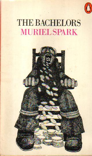
Here (right) we have Patrick, tied to his chair as he is during his trances, but this time, coins, not words, are cascading from his open mouth. The impression given is that Patrick makes money from his spiritualist performances, so the further implication is that Patrick is not genuine. This reading will colour the reader’s perception of the text right from the start.
The final cover for this book, however, is more likely to simply confuse the reader:
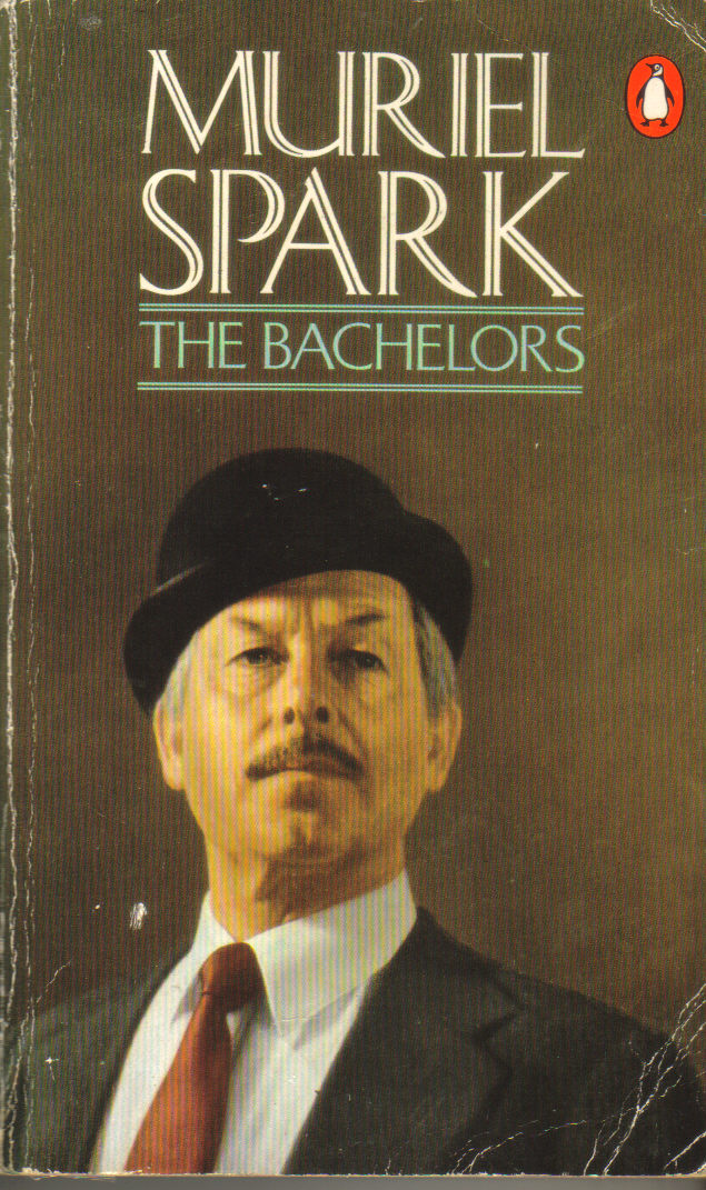
(left) I mean – what’s this about? It’s just a man of a certain age in a suit and a hat. It’s as if someone just searched for ‘bachelor’ in the Clip Art library and came up with this one. Not wrong, because the book is entitled The Bachelors, but not really right either. And the blurb on the back cover is weird too (see below):

Just who is supposed to be talking here? ‘He’s that dear little, sinister little medium’? Is it supposed to be the voice of one of the members of the Wider Infinity, Patrick’s spiritualist group? I suppose it could be, but clearly the last sentence is a narratorial voice rather than the voice of a character, which doesn’t help matters and makes the whole thing look a bit cock-eyed and cobbled together at the last minute. And what’s a ‘VHF of a flutter’ when it’s at home? Really, this is rubbish.
On to the next novel, The Ballad of Peckham Rye, also published in 1960. This story features a character called Dougal Douglas (or Douglas Dougal), who arrives in Peckham Rye and causes mayhem before departing. He has two lumps on his head which he claims to be the remains of horns removed by a plastic surgeon, but we don’t have to believe this. The designer of this cover, however, wants the novel’s readers to believe that Dougal really is an instrument of the Devil (below left):
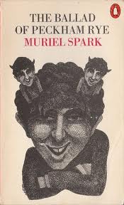
Here Dougal’s ‘horns’ are two miniature versions of himself, each with their own set of horns – which in turn will have horns, and so on and so on. Dougal is looking at us and grinning, as he is here (below right):

The grin is not so obvious, but can be inferred perhaps from the raised eyebrow and cheek muscle. This cover goes some way towards depicting the canteen scene in the novel, in which Dougal attracts a great deal of female attention by bursting into tears. A third cover does not depict Dougal at all, but focuses on Peckham itself:

Here, Peckham Rye has been made to look a bit like Las Vegas – which it doesn’t – but the artist has picked up on the dancing. There’s an awful lot of dancing in this novel, and of course the Devil loves to dance! But dancing is part of social behaviour and it comes with a whole set of rules and regulations of its own, to which the Peckham inhabitants add their own little rituals. In Peckham Rye, dancing is never very far from fighting (and vice versa, in fact), both of which activities are undertaken by savage and civilised societies. And dancing, of course, is so often a prelude to sex. William Boyd argues that this is a novel about sex in his perceptive introduction, and I’m inclined to agree with him. Sex, fighting and dancing. The inhabitants of Peckham Rye don’t really need a devilish figure running around to cause trouble, because it’s all happening already. Dougal, for all his funny ways, is merely a catalyst.
So now we come to my last novel for today, The Public Image, published later than the other two, in 1968. This story is about a second-rate actress, who has somehow become very successful, fighting to save her public image when her husband commits suicide.

The first cover (left) shows a diminutive woman struggling under the weight of a huge star bearing a wide toothy grin. The woman herself is frowning fiercely: she looks off-balance and is obviously unhappy with her position. This picture always reminds me of Atlas trying to bear the weight of the world on his shoulders, but Atlas, of course, had no choice. The idea that the public image is something from which the actress would like to escape is another example of a reading that is given to the reader in the cover image. A second cover looks like this (below right):

It’s very similar in some ways: a large smiling face, eyes hidden by sunglasses as is so often the case, and the shell appears in Frederick’s suicide note to Annabel: ‘You are a beautiful shell, like something washed up on the sea-shore, a collector’s item, perfectly formed, a pearly shell – but empty, devoid of the life it once held.’ (p. 92). The shell image reappears at the end, but I can’t say more without spoiling it. Finally, this third cover is very different:
This image (left) focuses not on the public image, but on the ruptured marriage – an image in negative of two people kissing is torn across the centre. This cover design incorporates Frederick’s role in Annabel’s public image, which the other two do not.
I’ll end with an image of Muriel Spark herself (below). Isn’t it fabulous?


PS. Aged and learned hubby informs me that ‘VHF’ means ‘Very High Frequency’ and that it’s a term used in radio. Aha. So now I’m thinking of lots of middle-aged men fluttering their hands rapidly in a helpless sort of way. All well and good as a (dated) piece of imagery, perhaps, but it doesn’t bear much relation to what happens in the book. It’s a bit ‘de trop’.
LikeLike